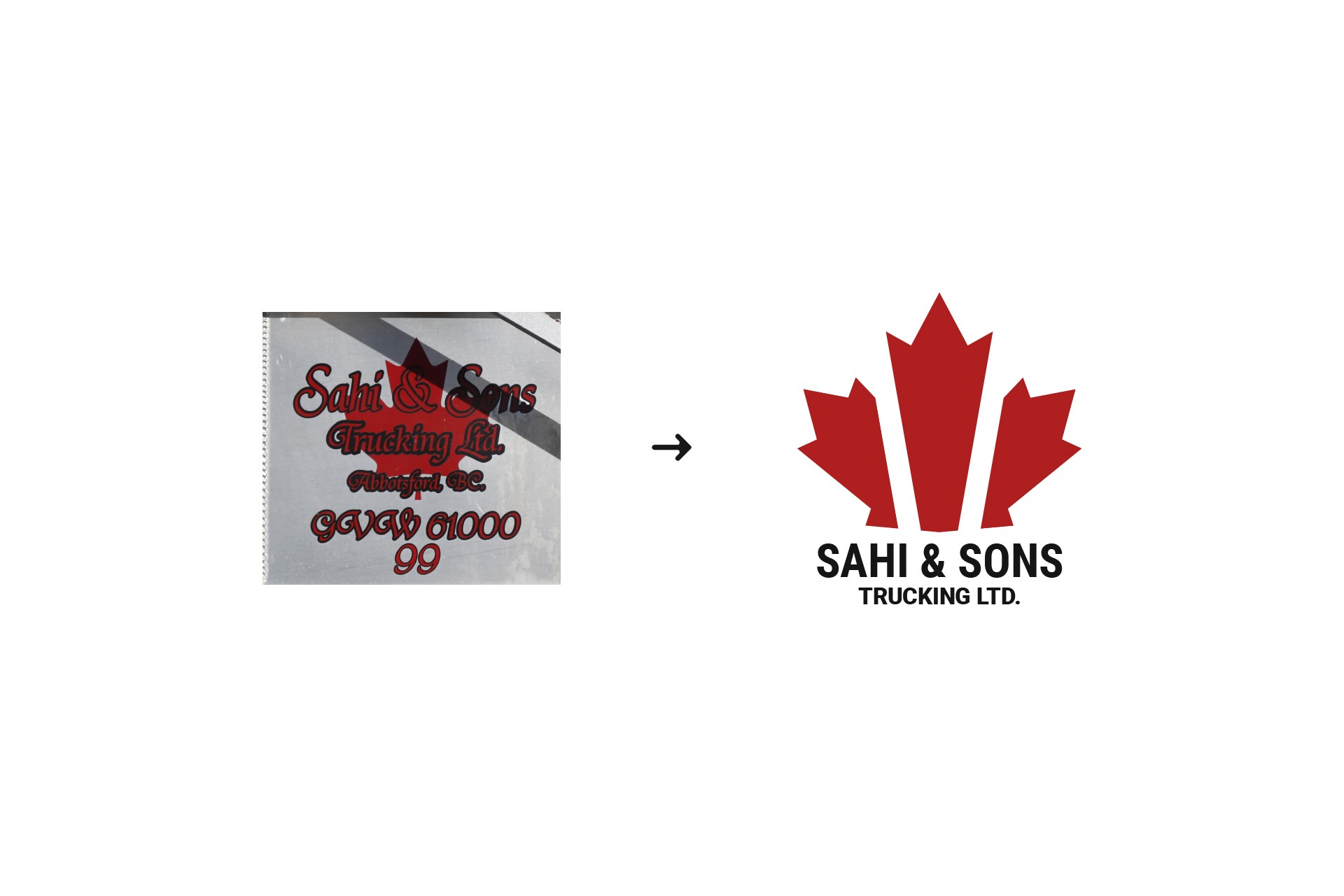
The maple leaf is a really important symbol to Canadians, so using it for a logo needs to be done smartly. I chose it because it represents a company that lives by the Canadian determination and hard work.
A company founded 2 decades ago sure feels ancient. The new generation of CEO decided to refresh the company's identity with a simple but efficient logo mark and some relevant collateral.


